
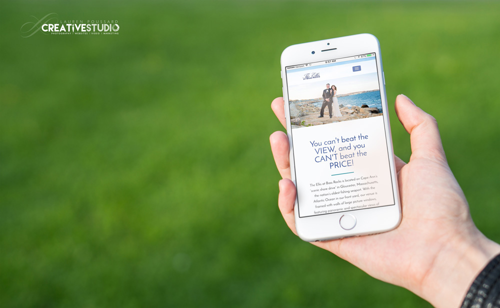
06 May What is responsive design?
Responsive design is the ability of a website to adapt to the device it’s being presented on. A responsive website automatically changes to fit the device you’re reading it on.
There are four general screen sizes that responsive design has been aimed at: the widescreen desktop monitor, the smaller desktop (or laptop), the tablet and the mobile phone.
Why does it matter? You want the visitors of your site to have the best possible experience and get to the information they need FAST, before they get frustrated and leave only to find your largest competitor! And with mobile users exceeding desktop users online, you have to take this into considering when designing your next website.
If you need a new website and want to be sure your users are having a great experience across all platforms, give us a call. We can show you some real-time statistics of our websites visitors by browser, by device to prove to you why this all matters, and we can definitely help you build a site that looks great and attracts and pleases your users.
No Comments