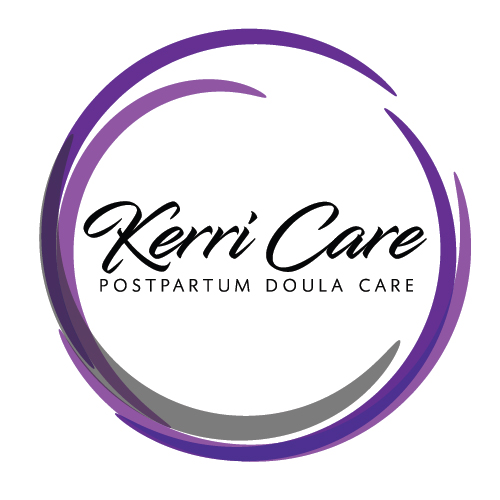
11 Jan New Logo for Kerri Care
Behold! A new logo is born this day!
When Kerri Care Postpartum Doula was looking for a new logo for their new business, they gave us a call and we got together to hash out some ideas. We knew the logo was going make use of purples and grays, be on the lighter shades, we did not want script fonts, no moons, perhaps a circle, and somewhere we needed to fit a baby in. Like so many designs, the end result was not what quite what we expected!
This actually happens ALOT.
Many times we start with a set of criteria and it morphs a bit throughout the process. Sometimes, even after sitting down together, you get a new idea, or start to think a bit harder about the future of the business, or direction of the company… and suddenly an element that was really important at the beginning is something you don’t want to get locked in to down the road.
As Kerri Care grows, perhaps newborns are not going to be their primary market, so in the end we left him out. We changed the modern serif fonts for a script font we both loved, darkened the purples, added a little black and voila, our logo was born.
Seems simple, right? But it’s not. We literally trolled through hundreds of fonts to find just the right ones, but when we saw it we knew – that was the one. We hand-drew some babies to try out in the logo, and then we scrapped them… we put the tagline in the middle, below – changed the tag line wording, just to name a few things. We went through many different revisions, but this was the winner.
Good luck to Kerri Care! We can’t wait to see your logo out in the community!
Some things to think about when designing a logo:
- Less is more. Don’t try to cram in too much. Look at the biggest companies on earth – their logos couldn’t be “simpler
- How is your logo going to be used? Embroidered onto shirts? caps? website? marketing materials?
- Colors – colors evoke many different emotions – what emotion are you hoping to create or connect to?
- Might you need to use your logo in different ways such that it might need to fit into different “shapes”. for example, are you thinking about creating a mobile app for your business? Perhaps you need it designed so it can fit into a square. But the header of your website requires a more rectangular version.
If you are looking for a new or refreshed logo for your business, please give us a call. Our first meeting is free and you are never under any obligation.


Sorry, the comment form is closed at this time.